Twelve columns
The main digital property, departmentofinformation.org, uses a strict 12-column vertical grid with no underlying horizontal grid. The same rules of typography and column width apply to digital and printed matter alike.
This guide sits on the same grid: 12 columns with 24px gutters and 48px margins, or 4 columns with 16px gutters on phones.
Twenty-four columns
Larger and more complex media, like posters and broadsheets, may need more complex layouts. Use a 24-column grid there.
Layouts
A flexible, modular vertical grid lets type and media move between platforms. Use space so it is both functional and visually appealing: maximize it while respecting content hierarchy, minimalism and the brand standards.
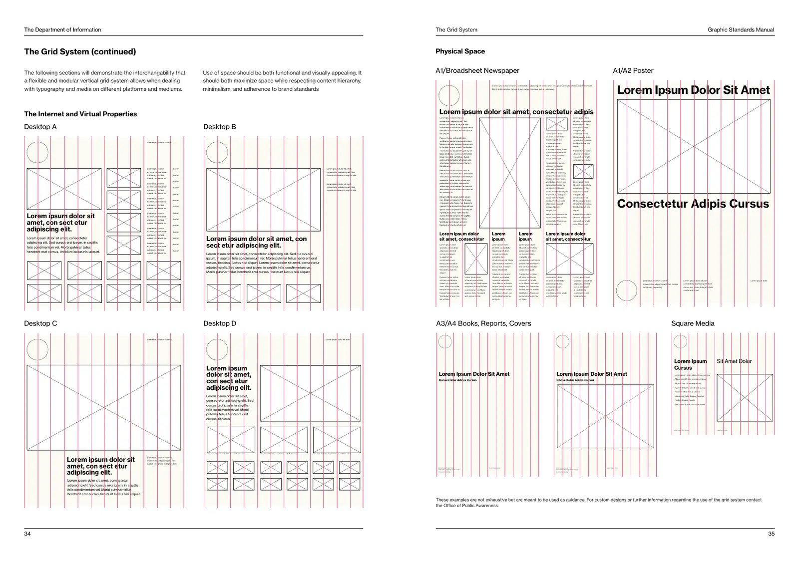
| Medium | Grid | Notes |
|---|---|---|
| Websites | 12 columns | Strict. No horizontal grid. |
| US Letter, #10 envelope | 12 columns | 0.5in outer margins. |
| A3/A4 books, reports, covers | 12 columns | Seal top left; title in Bold on a column line. |
| Square media | 12 columns | Split 6 and 6, or 4 and 8. |
| A1/A2 posters | 12 or 24 columns | Headlines can run the full width. |
| A1 broadsheet newspaper | 24 columns | Text columns of 3 to 4 grid columns. |
These examples are not exhaustive. For custom designs or further guidance on the grid, contact the Office of Public Awareness.