Color order
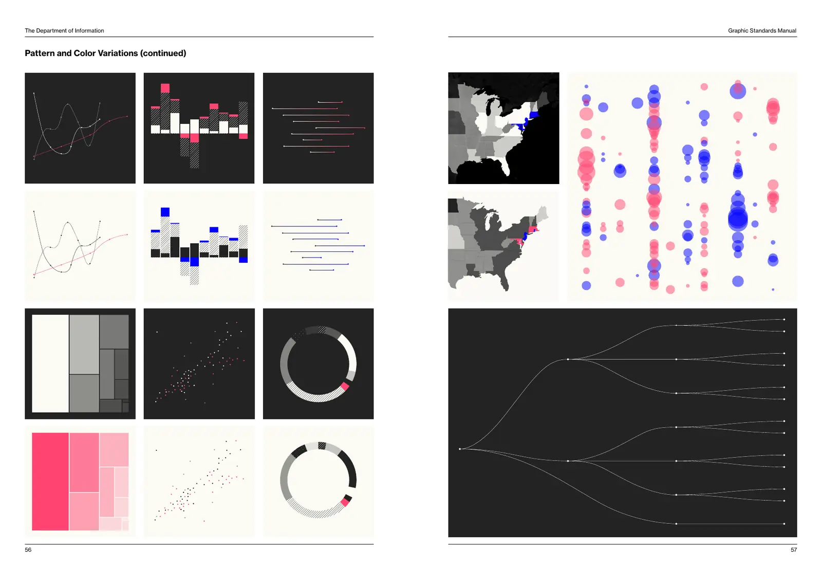
Charts use Department Black and Manila, including their tints, until every option is exhausted. Only then do they borrow, conservatively, from Beaurocracy Blue, Embargo Red, their tints and the pattern library.
To maximize minimalism and efficiency, use as few superfluous elements as possible. Grids, measurement lines and x- and y-axis lines appear only when they are absolutely critical to the information.
Live example
This chart is drawn from the color tokens, so it follows the theme. Patterns, not hue, separate the series.
Distribution of letters
- A
- B
- C
- D
- E
Source: The alphabet
Do
Title every chart in Bold, label values in Roman, and cite a source in the muted text color underneath.
Don't
Add gridlines, borders, shadows or 3D. Don't use Red for anything but the one value that is anomalous.
Pattern and color variations