Department of Information
Graphic Standards Manual

Issued by the Office of Public Awareness.
Department of Information Graphic Standards

Geospatial RepresentationGraphic Standards Manual

Geospatial

Maps emphasize topography and spatial relationships over labels and place names. Cartographic data comes from OpenStreetMap unless otherwise noted.

Edit this page

Maps

Mapping uses lighter colors on darker backgrounds to reflect the brand’s tone, but context decides the final foreground and background.

Prominent boundaries and features, such as roads, topographic markers, transit lines, trails and waterways, keep consistent outline colors and weights in order of importance. Overlays can be any of the brand colors, or a combination of brand colors and patterns.
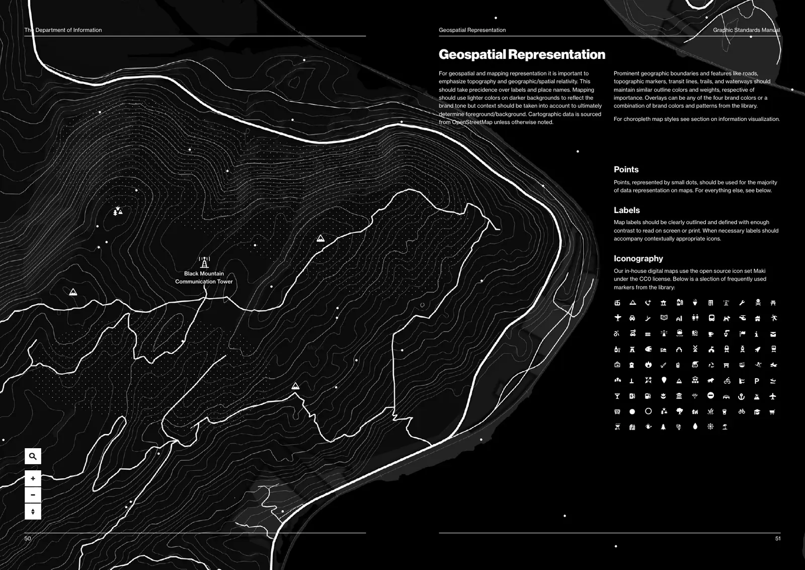
Manual spread: a black topographic map with fine white contour lines, bold white roads, dotted fields and small white icons, with the page text and a grid of map icons.
Topography in Manila on black. Map controls are square, white on black.Manual, pp. 50–51

Points

Small dots carry the majority of data on maps. Use another marker only when a dot can’t.

Labels

Labels are clearly outlined and defined, with enough contrast to read on screen or in print. When necessary, labels sit with a contextually appropriate icon.

Iconography

In-house digital maps use Maki, the open-source icon set, under the CC0 license.

Density and choropleths
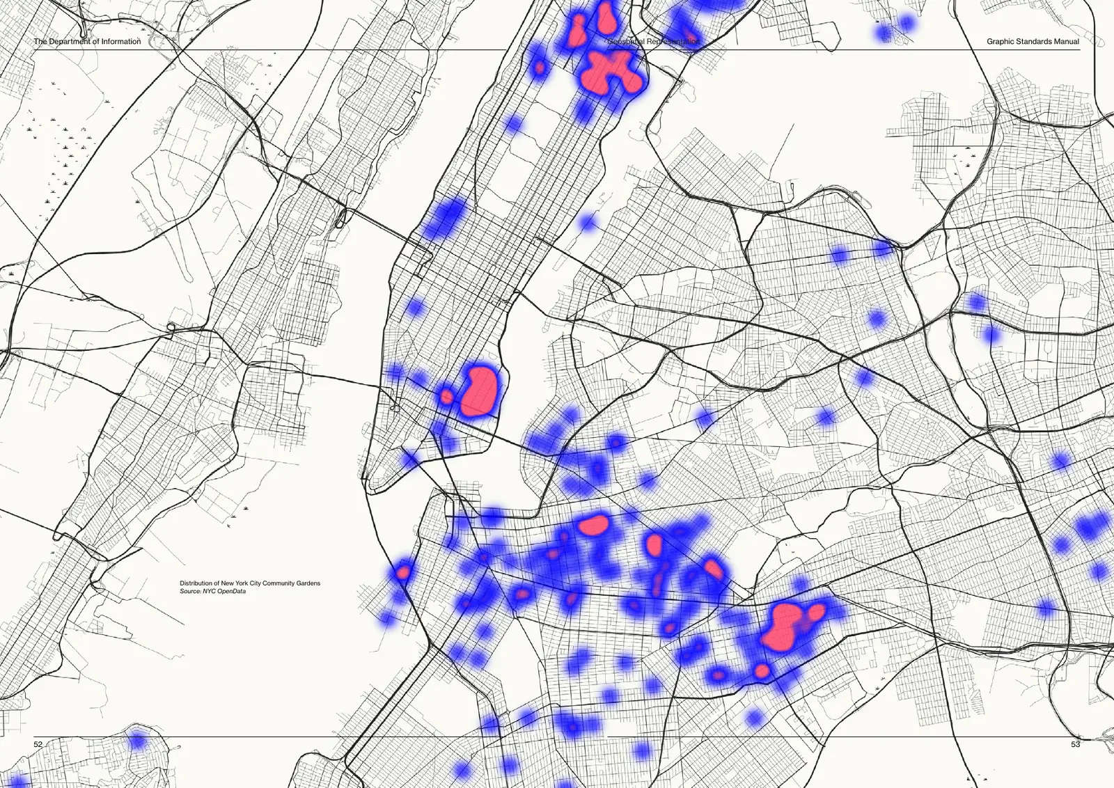
Manual spread: a fine black street map of New York City on Manila, with blue heat blobs that turn red where community gardens cluster.
Distribution of New York City community gardens: Blue for presence, Embargo Red for the densest clusters. Source: NYC OpenData.Manual, pp. 52–53

For choropleth styles, see Information visualization.